This was a previous shot of the living room. I altered this area of my level by desaturating the wallpaper and making it a more deeper colour by going back to a darker blue.
i also z-brushed the blue ottoman as in this image above it looks very box like and without any defining chair like qualities
I also changed the material of the chair and settee to a softer and smoother material and darkened the wood on the chair.
Along the walls i added the wooden panels mentioned in the earlier blog.
This image is a good example of the over saturated issue.
I have desaturated everything in this room.
I have improved the cabinet on the top left of the image and made it look more stately as opposed to the light coloured quite boring cupboard i previously have in
i also changed the fireplace as visually it was quite ugly, i have replaced it with a much more impressive and more intricately designed fireplace.
I also added sun beams to some of the windows as it made the level look like there was something outside of the house instead of just being the interior to a house. To accentuate the light i added a plane with an extreme emmisive applied to it so that it would shine out between the blinds and create a sunny day effect.
Attic
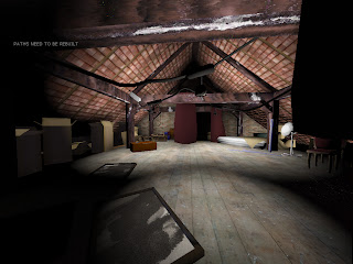
To make this area of my level more closed in as throughout this project size has been a big issue, i decided to make it more shadowed and also mentioned in my sketchbook this also made it more atmospheric and as this is an area of the level my character is hiding out in it seemed that it would be quite a dark area.
I also found that when i dimmed the lights that quite a few of my assets were being wasted in the shadows so i then had to bring them out into the light this also helped with the sizing issue as it made the area seem smaller.
The hall
The hall was more an issue that the other areas as this area in particular seemed overly big so to try to combat this i also added the wooden panels from the living room to the hall as well this had the desired effect, in that it enclosed it more and made the space feel tighter. i will continue to improve tis area till the end. By making pictures for the walls, and various other things to hang up.
The top of the stairs was another area I had problems with but in this area the problem was the lighting as the area was too dark. It seemed to be that the only was to make it lighter was to put the light on at the top of the stairs which would not be right as the level is set in the day and would look odd so i put in a window and a small sky dome just outside to make it look as if there is an outside to my level, I still have yet to create the texture for this but I don't anticipate this taking too long.
Interactive elements
Since the last presentation I have added a few interactive elements including
Another opening door from the attic to the landing
and various Light switches to lighten the more darker areas if the player needs it.
Subscribe to:
Post Comments (Atom)


No comments:
Post a Comment